
Op Art descended out of geometric art of the 50’s and the Bauhaus movement in Germany, which I have previously written about in the Origins of Flat Design. The 60’s was a period of discovery in science, psychology and new technology. This type of art reflects the experimental mood of that era. The pieces normally feature patterns with stark contrast between the background and foreground that dazzles the eyes and the senses. The sensation of movement in the pieces is both appealing and disconcerting.
The Responsive Eye Exhibition
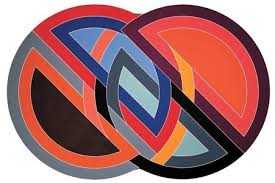
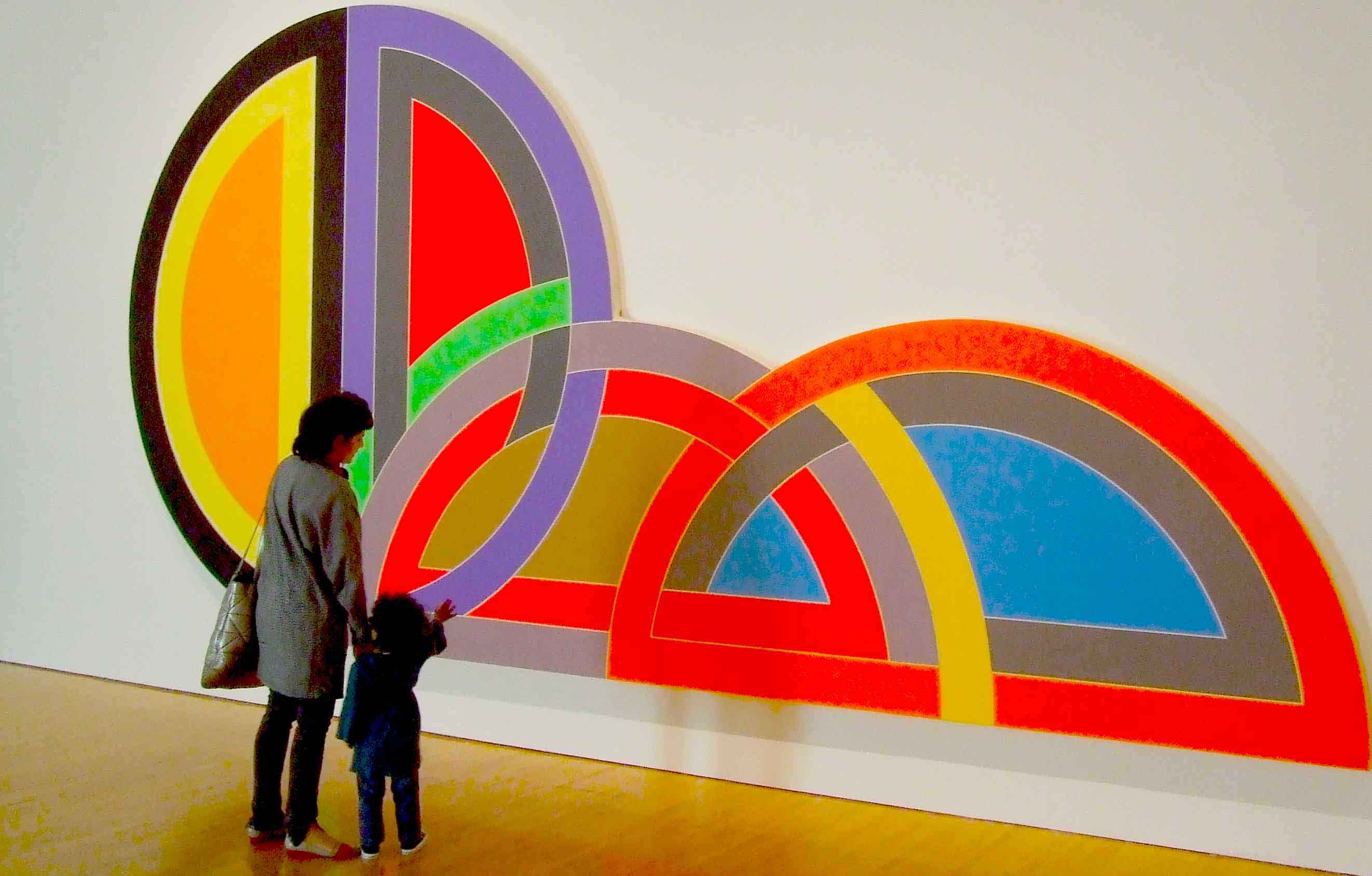
Op Art had its watershed moment during the Responsive Eye Exhibition at the Museum of Modern Art in New York in 1965. This featured 123 paintings and sculptures by artists such as Victor Vasarely, Bridget Riley, Frank Stella, Carlos Cruz-Diez, Jesus-Rafael Soto, and Josef Albers.
In the 1960’s, Op Art made a huge impact on the popular consciousness. In the mid 60’s the movement infiltrated popular culture and was featured in clothes design and also in movie posters of the time, like Alfred Hitchcock’s ‘Vertigo’. Although, Op Art has always been overshadowed by its more commercially viable and kitschy cousin – Pop Art. This emerged at the same time and had the ultimate poster boy and advocate, Andy Warhol.

How Op Art Works
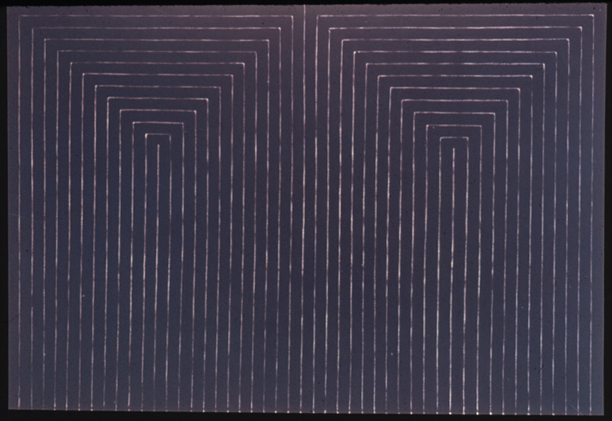
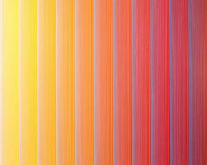
Pattern and Line: By creating discord between the figure and background, it makes the two planes have a tense and contradictory relationship. The background and figure seem to float and move in the eyes, popping out of the picture and fighting for attention.
Grisaille: This effect is created by using black and white wavy lines close together that create a volatile and strong relationship, looking at these pictures soon becomes hard, as the eyes begin to feel dazzled and sore.
After Images: After viewing the image, a negative is briefly burned onto the retina, before disappearing.
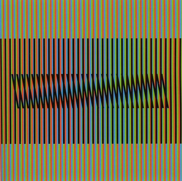
Splashes of Colour: In 1966, there was an explosion of colour in Op Art, with artists Bridget Riley and Richard Anuszkiewicz leading the way. Contrasting colours brought different effects to the eyes. For example in Anuszkiewicz’s ‘temple’ paintings, two high contrast colours are used to create a sense of depth. This gives the illusion of three-dimensional space, as though a pyramid is popping out of the picture.


The use of pattern and color always impresses me when I look at Op Art. Though, some pieces can give me eye-strain. 😉
Great article. Thanks for sharing this bit of modern art history!!
Very Best Regards,
Eric
LikeLiked by 1 person
Hey Eric.. always love to hear from you. And so glad you liked this one! I find it hard looking at these things in art galleries. There was one that was three dimensional one done with wire in the National Gallery in Melbourne which was pretty amazing and didn’t hurt the eyes. Been hunting around for a photo but couldn’t find it. If you ever get to Melbourne, Australia you should check out the art galleries, they are amazing. Take care
LikeLiked by 1 person
Nice.
I am in possession of an original 16mm film by Brian DePalma called ‘The Responsive Eye’ (1968, I think), which is all about Op Art. I have never watched it because I am scared of destroying the film, and I have never gotten off my butt and bought a good projector to run the spool through.
I have attempted to ensure it is preserved adequately, and have contacted various film luminaries and museums about it, but the response has been lacklustre…
Perhaps I should do a blog piece about it on my ‘normal person’ blog. The story of how I came to be it’s caretaker is a long and weird one. Maybe that’ll get someone’s attention.
LikeLiked by 1 person
Hey I forgot to ask, can you give me access to your other blog. I really enjoy your writing
LikeLiked by 1 person
Thanks! It’s https://ramblingsofinanity.wordpress.com/. Go for your life. Not much there at the moment, but I do plan to load up some words and other bits.
I appreciate the support!
LikeLiked by 1 person
I’ve had a look around and liked it too 🙂
LikeLiked by 1 person
Hmmmm.. If this was music it would be a pink noise generator running through a filter sweep with an 80s keyboard playing melodies in the background.
LikeLike
I love that you could hear the music to go with this😉 and yes I agree it would be something glitchy for sure
LikeLike
Yes, glitchy is the word
LikeLike