It’s no secret that I adore infographics. Even better are infographics or interactive media that has a personal angle. This enables the user to better relate to and absorb the information in a meaningful way.
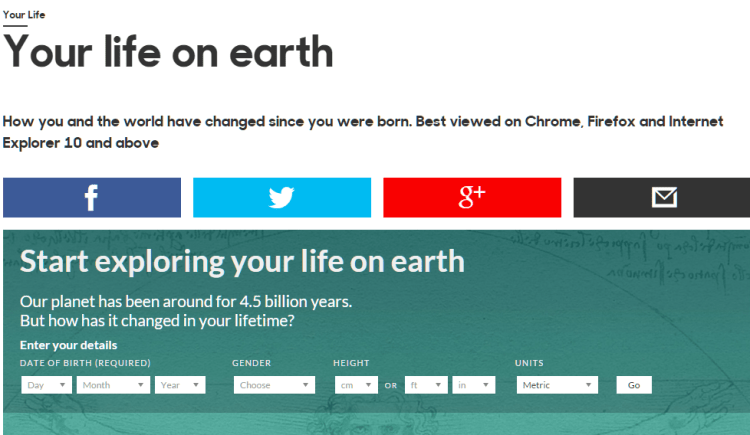
This interactive infographic from the BBC certainly does add a new dimension to the data. It’s a clever combination of science, philosophy and geekery which is really appealing. If you haven’t jumped the gun and tried it already – dive right in!

I love that this infographic does a great job of explaining how infinitesimally small and insignificant we all are – which paradoxically makes it all seem more precious because it’s so fleeting. There’s something very zen about this.